This project involved redesigning a wedding planner’s website to make it easier for users to find information and book meetings. The goal was to create a simple, clear site that builds trust and shows the planner’s personality. The redesign focused on improving navigation and the booking process.
Identifying user groups
Cards,
Interviews,
Made component library,
Screen
design,
Plantation


The old website had unclear navigation, making it hard for users to find information or book a meeting. The booking process itself was confusing and caused drop-offs. The design and wording were inconsistent, which made the site feel untrustworthy. Key services weren’t explained well, and users couldn’t quickly understand what kind of wedding planner they were dealing with. Overall, the site didn’t support the needs of people planning weddings, especially those looking for someone they could rely on and connect with.
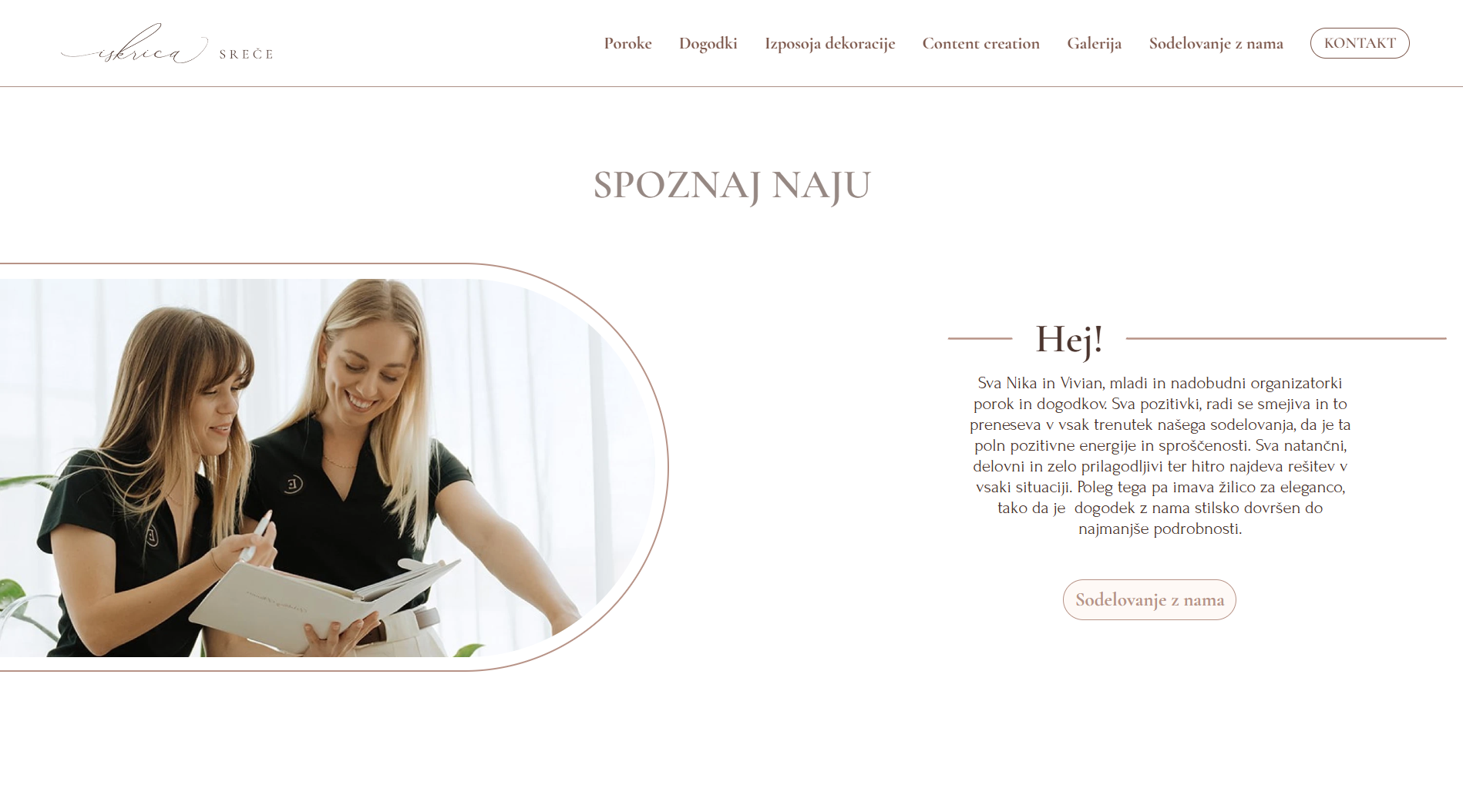
Weddings are often emotional and personal events. Most decisions are based on trust and feeling comfortable with the planner. People usually look for someone whose style matches theirs and who seems reliable. The website is often the first place where users try to understand who the planner is and whether they would be a good fit. It needs to give a quick and honest impression while clearly showing the range of services offered.
People who hire wedding planners are usually couples who feel overwhelmed by the scale of organizing a wedding. They might be planning a large event, a small intimate ceremony, or even a wedding in another country. These users are not just looking for someone with experience, they want a person they can trust and feel comfortable with. The connection needs to be both reliable and personal. They want a planner who can guide them but also work with them in a friendly and supportive way.

To make sure the website met user needs and built trust, I ran user interviews, card sorting, and reviews. Through this research, I found issues with the way content was structured, how the site communicated the planner’s personality, and how easy it was to book a meeting. These findings shaped the design choices I made moving forward.

I interviewed a group of potential clients to understand what wasn’t working. Many found the design and wording inconsistent, which made the site hard to navigate. They also wanted a clear way to book a meeting without guessing where to click. One of the strongest points was that people needed to get a sense of who the wedding planner is not just what they offer.
Through card sorting, I saw how people naturally group and search for information. It became clear that the current structure didn’t help users understand the type of planner they were dealing with. Since hiring a wedding planner is personal, users wanted to sense the planner’s style right away.
The site was too inconsistent and hard to follow. The booking flow wasn’t clear, and the planner’s personality didn’t come through. I used these findings to simplify the navigation, fix the structure, and adjust the content so that it shows what kind of person the planner is not just their services.
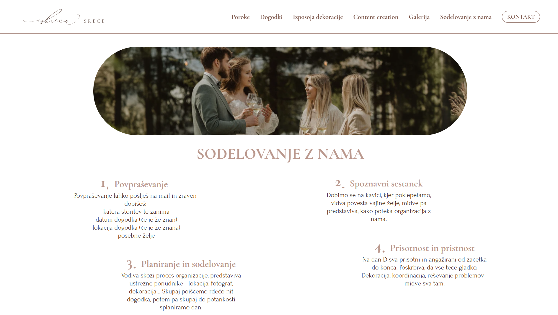
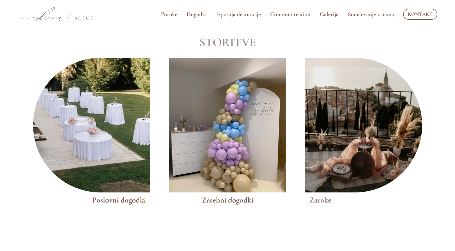
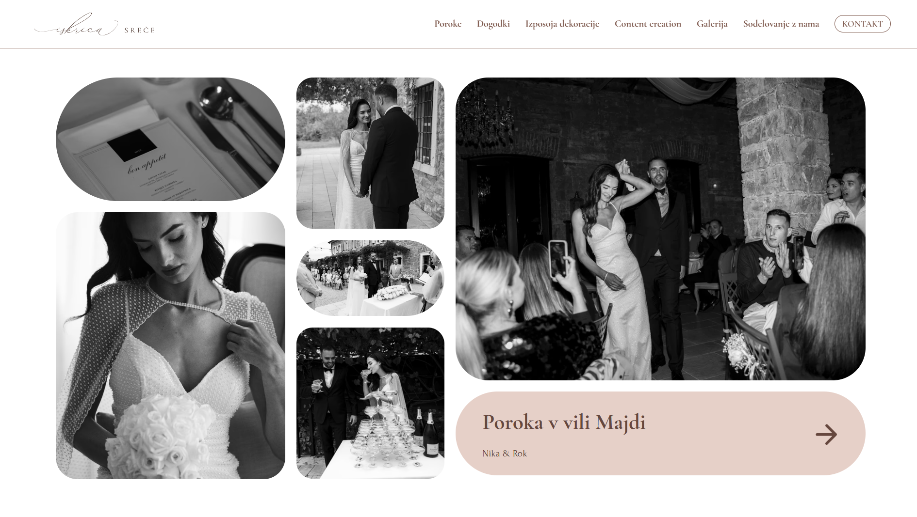
The layout is made for quick scanning, with clear paths to booking a meeting. I built a basic design system with reusable components to keep the look consistent across pages and reduce confusion. To build trust, I included a gallery of past weddings with real photos and testimonials. And to show the variety of events the planner handles, I added a section that clearly separates different types of weddings each with its special tone.

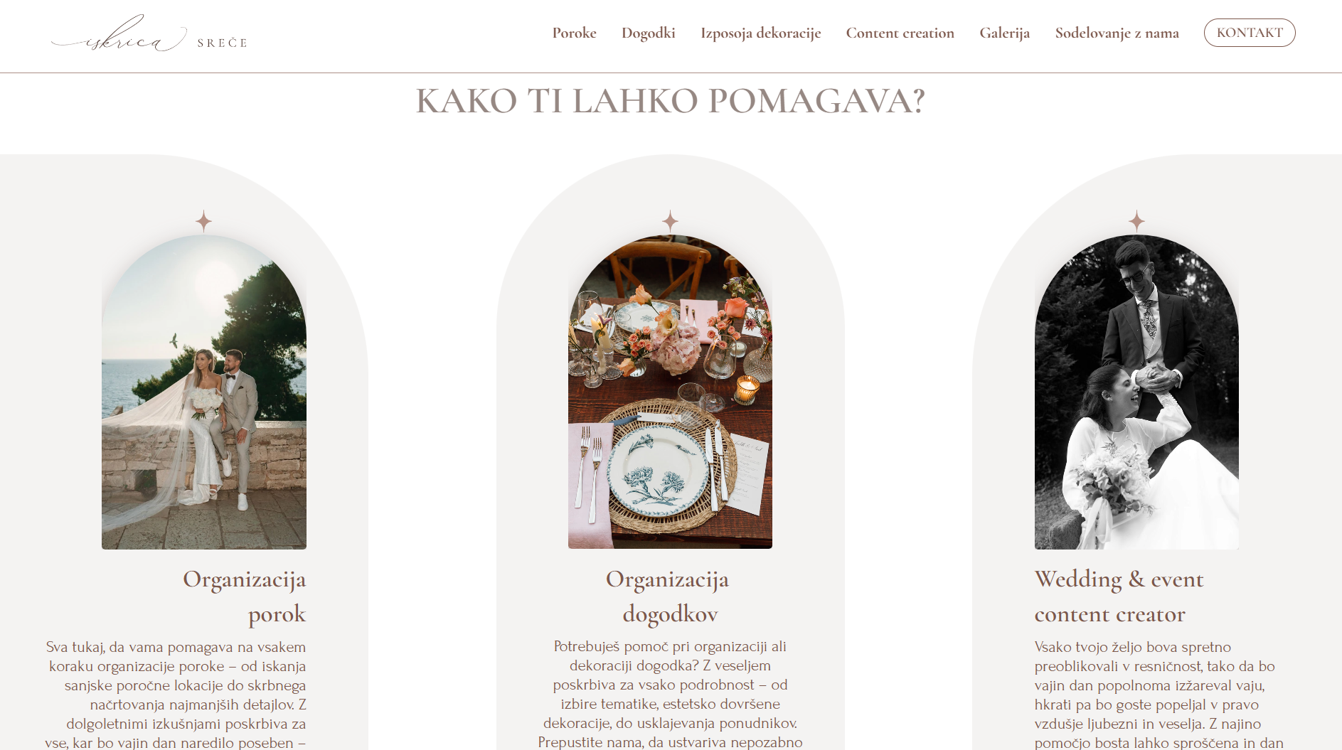
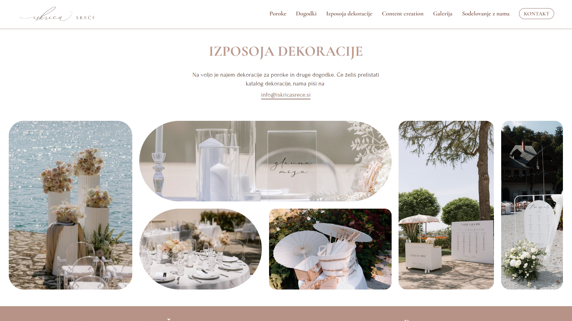
Visitors use the site to explore what the wedding agency offers, see which wedding styles they specialize in, and learn how the planning process works. The site guides them through available services, past weddings, and what to expect from collaboration, from first contact to the big day.

The new design resulted in a 48% increase in bookings in half of a year. Users were able to find information faster, understood the services more clearly, and connected more quickly with the wedding planner’s personality. The updated structure, consistent wording, and improved mobile experience directly addressed user pain points identified in research.

