
This project focused on redesigning a warehouse management platform by moving it from a local to an online version. The structure stayed mostly the same to avoid affecting performance in the warehouse, where speed and accuracy are critical. The goal was to improve ease of use without slowing users down, ensuring a smooth shift to the new version without disrupting daily work.
Adapted legacy logic for web
Created a comprehensive design system,
Maintained brand identity,
Improved workflow effectiveness,
Clarified and refined operational processes


The old system was outdated and no longer supported efficient warehouse work. It slowed down tasks and didn’t meet current needs. A newer version was needed to keep up with modern workflows and help users work faster and more clearly.
In warehouse settings, people need to act fast and make decisions without much room for error. The design had to support this by being quick to understand, simple to use, and reliable across different types of warehouses whether it’s for foods, clothes, electronics, or heavy materials. The platform needed to scale and adjust to different industries, but stay consistent in its structure.
Warehouse staff using the platform often come from hands-on, fast-paced work environments. They’re practical, task-oriented people who rely on clear instructions and quick access to the information they need. Most of them are not very comfortable with technology, so they prefer systems that are simple, predictable, and don’t require much training. Their priority is getting the job done efficiently without confusion, unnecessary clicks, or unclear processes.
For the research, I went through the existing platform step by step and looked for points where users might get confused or stuck. I focused on areas that were unclear, had missing or overwhelming information, or where users were likely to make mistakes. I also looked at which steps could be made faster or simplified. For each issue, I noted how critical it is and what type of problem it was. This helped me understand where the biggest problems were and what needed fixing first.

Some screens had unclear labels or icons, making it hard for users to understand what actions they were about to take. For example, buttons like “Complete” or “Process” didn’t always reflect what would happen next in the workflow.
Users often needed more context to complete tasks, like not knowing if an item was already scanned or what the next step was. Simple cues like confirmation messages or progress indicators were missing in key places.
Screens were sometimes crowded with details that weren’t relevant for the task at hand, like showing every shipment status at once. This made it harder to focus and slowed down routine actions.
Tasks with similar buttons placed too close together like “Submit” and “Cancel” led to frequent mistakes. Also, actions that couldn’t be undone made users nervous to continue without double-checking everything.
The challenge was to update the look and feel without breaking habits. I kept key patterns like the layout of menus and buttons in the same place, and only changed things where it helped make tasks faster or easier. The result was a platform that felt like an upgrade, not a completely new tool. The design now supports faster access to data and helps people get through their tasks without extra clicks.

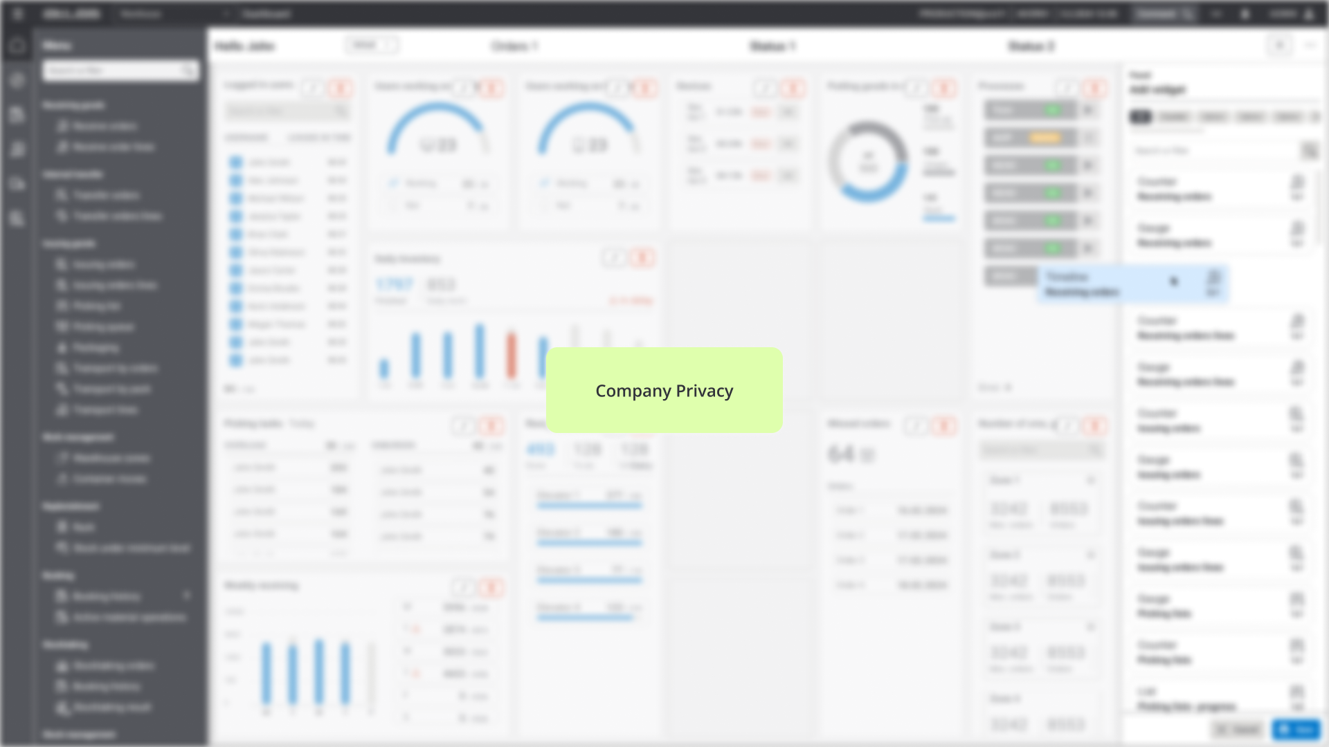
The same system is used in different warehouses, but each version is adjusted with small changes to fit the specific way that company works. While the visual side of the app was refreshed, the core layout stayed the same. This helped users avoid confusion and adopt the new version faster. The dashboard became the centre of the app it gives quick updates and live data in one place. Users can set it up to match how they work.

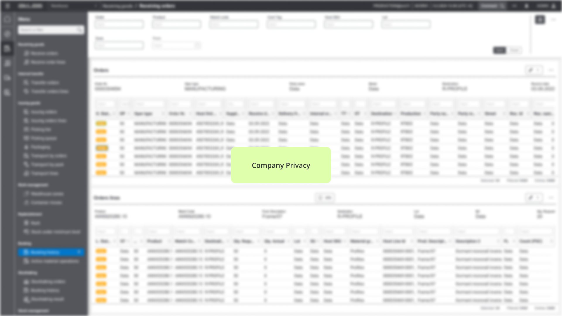
The redesign improved efficiency by combining multiple screens into a single, centralized dashboard. Users no longer need to switch between eight separate screens, which speeds up their work and reduces confusion. The platform keeps the familiar structure to avoid disrupting users, ensuring a smooth transition. Clear guidance and a simple interface help warehouse staff with varying computer skills complete tasks with less effort and fewer errors.

